
I won’t lie – I’m not sure about alcohol inks yet! I saw a video by Michelle Short of The Card Grotto using stencils with alcohol inks and I thought “Wow! That looks amazing! I want to give it a try!” so I gave it a try and I think maybe, I should leave this kind of thing to the experts!! Whilst I did get what I was after, I think I used too many inks and so it looks like a hot mess!
I filmed the card making process – which is probably why it went so horrifically wrong! (nothing like filming yourself to help things go wrong!)
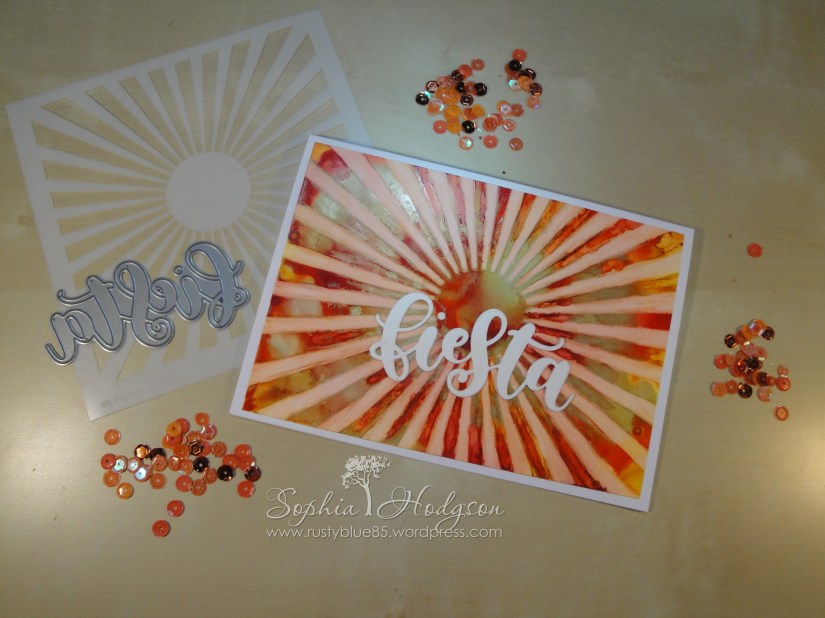
I only have 6 bottles of alcohol inks (two packs of 3) and whilst my usual ‘safe’ colours are towards the cool blue/green end of the spectrum I wanted to use the ‘Fiesta’ word die by MFT, so I felt a warmer palette would be better for that fiesta feel. I picked out ‘Sunshine Yellow’, ‘Valencia’ and ‘Red Pepper’ and the gold mixative.
I dropped all of my colours all over the Yupo paper, it looked very vibrant and this was the look I was going for, so so far, so good. I waited for the inks to dry, then placed my stencil over the paper and used surgical spirit to wet a felt applicator tool and wiped it over the stencil. DISASTER… the alcohol had seeped under the stencil, the lines weren’t neat and obvious and due to the size of the stencil it hadn’t covered the whole inked piece. It looked dreadful… cue much foul language… I went and cleaned my stencil in the sink whilst I contemplated what to do to try to salvage the situation (yupo paper isn’t cheap – I wasn’t going to waste it!)
When I came back I looked at it and I thought, well if I can fix the rays so there is more of a demarcation between the inked areas and the ‘lifted’ rays that would make it look better. So I dipped a cotton bud in the surgical spirit and wiped it over one ray – it looked better, so I set to doing this for all the rays (yes, it took ages!) It ended up how I had envisaged it to be, but the inked areas still looked ugly – probably due to the multiple colours. Anyway, I trimmed the paper down a bit to stick it to a 5×7 inch card base.
For the sentiment I die cut three ‘fiesta’ word dies from white paper and adhered them one on top of the other to create a dimentional word. I wanted it to be white because the background was just soooo crazy I didn’t want the sentiment to be shiny and I didn’t want to add any sequins or enamel drops or any other embellishment!

What do you think? Try again with less alcohol ink colours or just give it up?

